Introduction:
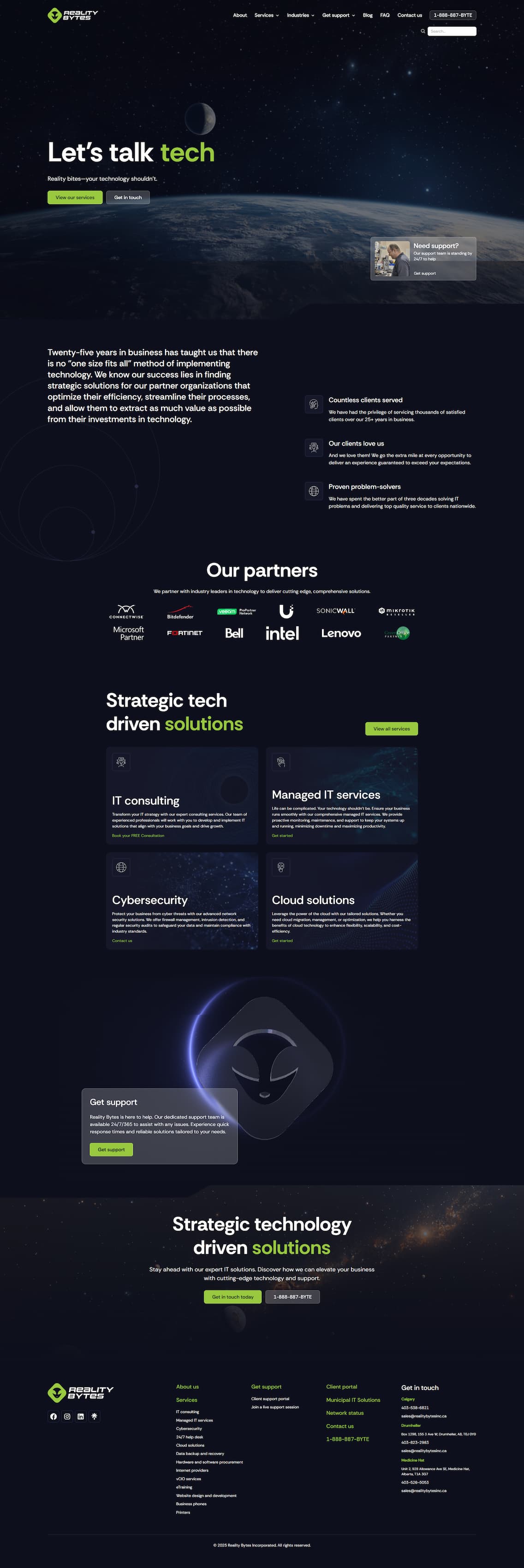
Reality Bytes is a technology company focusing on business solutions for small to medium sized businesses in Western Canada. Reality Bytes was originally established in 1998 by owner John Shoff. The company started out as a small IT consultant firm and a small retail store. Over the next 25 years of operations, the company grew year over year, and more employees were brought on board to handle the new business growth. We wanted to redesign the old website to make it look futuristic.
How it was build:
We started building the redesigned website by creating the full-screen navigation. To make it look futuristic, interactive, and user-friendly we used high-resolution futuristic images for the main link category that will change whenever you hover on different main link categories. We also used the native tab element of Webflow to achieve the expanding text that will show the sub-link whenever you click on the main link.
Next, we built the home page hero section. We created the image first using Adobe Photoshop. We separated it into 4 different images: the background, desktop, tablet, and mobile. We used these images as it represents the breakpoints of a website. The reason we separate the images is to make it interactive. Using the native Webflow interaction, we made it 3D and whenever you hover on any location of the background, the devices will slowly move on to where the cursor is.
We created the next section to have quick links for our major services that Reality Bytes Inc provides. To make it look futuristic, we used digital looking stock videos and native interaction to hide and show the quick links for each service category.
Next is the Leading Partnership section showing interactive partnership logos. At the map section, a map of Alberta displays the location of all Reality Bytes offices. We used blue-green circle and added hover interaction to show the details of every office. The Testimonial section- has an infinite looking slider. To achieve this, we used Slick Slider and added the comments of customers from Google. The Footer section has a simple layout to show the Site Map of the website.
Once the whole home page was created, a loading screen was built using the new logo and a white background and the inner pages of the website, different futuristic/digital images that correspond to every page was added.
Result:
The redesign of Reality Bytes Inc. is now a futuristic theme looking website with its new logo and color shade. We used interactions using the contents from the old website and added high-resolution futuristic looking images. Also, the new pages have its own unique interactions, like the Our Team page. This page features the Employee of the Month and the list of staff in greyscale, that colors when hover-on the images. We also achieved a very interactive full-width navigation that fits all the pages that the Reality Bytes Inc. website formerly had.
Conclusion:
The website design was fun but challenging! We created a responsive and interactive full-width navigation using the native Webflow interaction. We also made an infinite marquee interaction using JavaScript and CSS. Lastly, we integrated marketing materials from Veaam and Lenovo.

